VEG+ Data

A project for the Science Institute of Juice+ Company


How can scientific data be used in a way that a broad audience can make sense of it? A good year later and a lot of work, together with our clients Mag. DDr. Manfred Lamprecht and his team from the Juice Plus+ Science Institute, and our database specialist, Matthias Augustin, resulted in a wonderful outcome.

The starting point:
Nearly 15 million data records

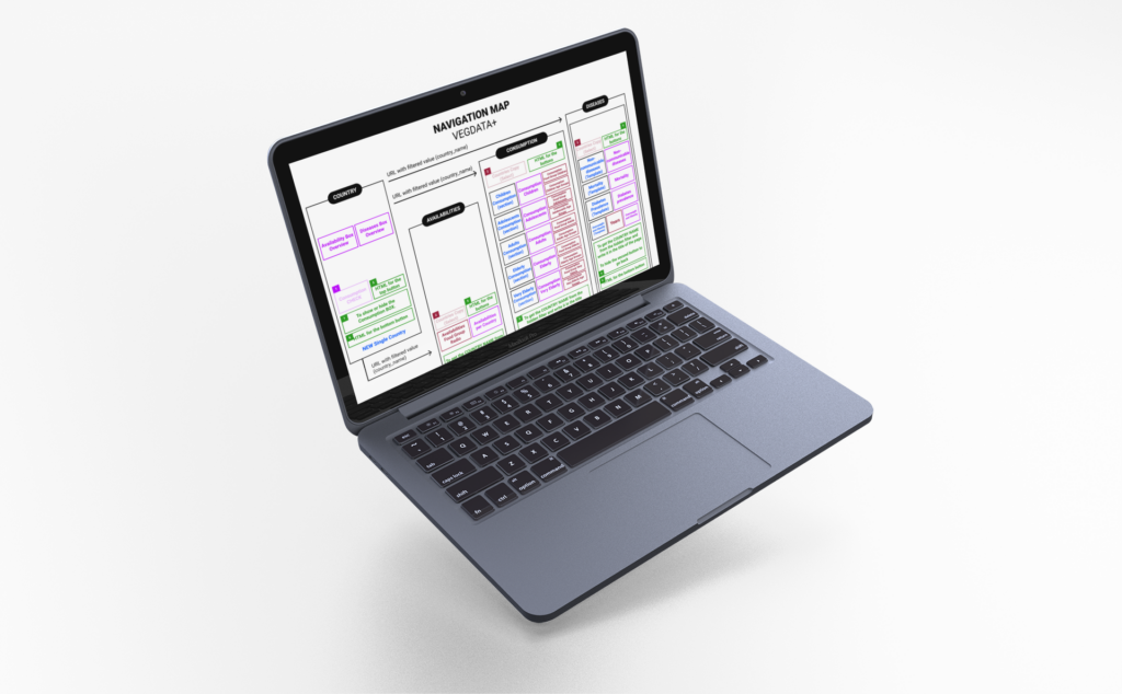
We collaborated with the Juice Plus+ Science Institute to transform existing databases into a web database. The three main databases can now be filtered, compared, and provide meaningful data in various views.

Automated Country Templates

The representation of subpages and data is generated automatically, showing only what makes sense based on the available data.

Features

Database

Manual cleaning of the database, definition and merging of terminologies, normalization, and optimization for display.

Script-based transformation for standardization during updates.

Navigation including dynamic elements

All main categories and topics can be accessed through the main menu. Country pages can be selected through a dynamic search.

Complex database queries

Various database queries were used depending on data representation and integration with existing reference values to make tables and graphics dynamically operable and filterable.

Optimized Table Views

Table views are filterable, sometimes with multiple variables. Emphasis was also placed on responsive web design and optimized loading times in the display.

Country selection
List format with dynamic search for country selection.
Zur Länderauswahl
Country overview page
Includes geolocation, overview of key figures, and selection of subpages depending on data availability.
View an example for Austria
Filterable data in table view
Multiple filters and data, as well as reference values, are dynamically updated by age group.
For example, for Austria
Interactive Map Graphics
By narrowing down the desired value range, the world map is dynamically adapted. Values per country are available as a mouseover.
For example, the frequency of diabetes
Diagrams for data representation per country
After selecting the desired country, the absolute numbers of food group availability are presented in a pie chart.
Click and choose the desired country
Absolute numbers in direct comparison
Compare two countries with all available values.
Click, select health condition, and choose the desired country
Previous slide
Next slide

Join Our EMail List

Want to stay updated on any news from keingrammfett?